Details
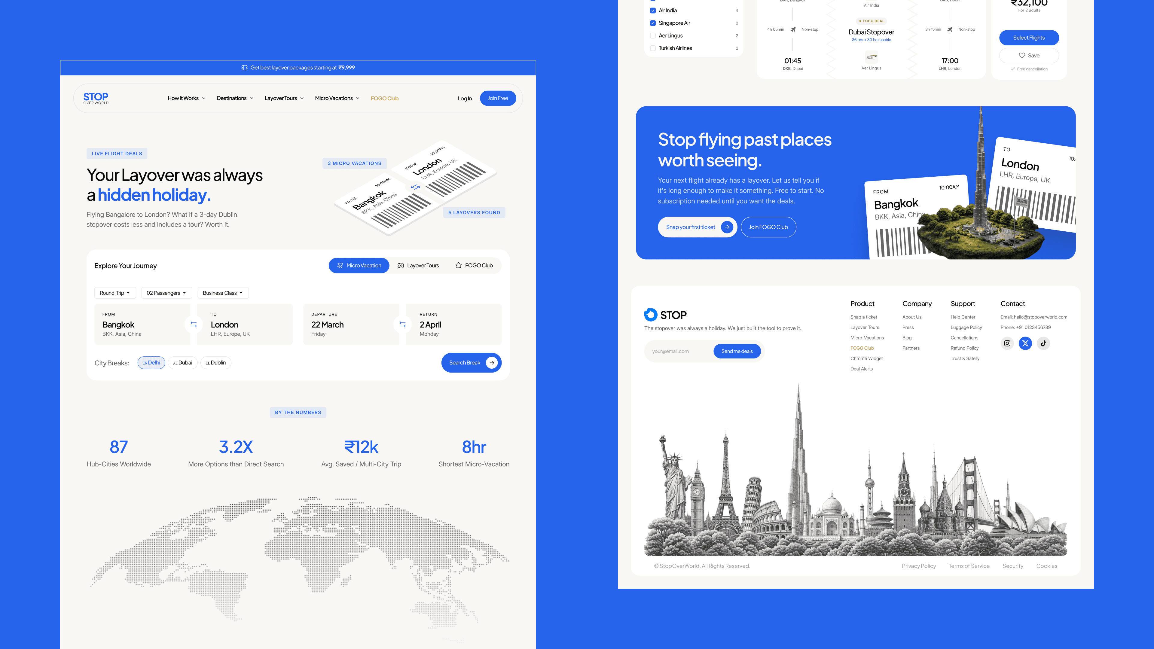
STOP: Multi-Faceted Layover Booking Platform
The Constraint: Travelers lacked a streamlined way to intentionally book layovers and turn transit time into micro-vacations. The core challenge was to visually communicate a counter-intuitive business proposition to the user: that booking two separate flights plus a curated layover vacation is often cheaper than booking a single direct flight. My Role: Engineered the end-to-end UX/UI, focusing on consolidating disparate data streams (flights, hotels, and local tours) into a single, frictionless 5-step booking engine. I had to ensure the price-comparison logic was front and center without causing cognitive overload. The Impact: Delivered a highly scalable booking architecture that successfully visualized both the core price savings (Direct vs. Layover) and complex time-management constraints (transit buffers). This immediate transparency proved the platform's value proposition, built user trust, and streamlined the checkout process.
Services
Consumer Web
Complex Logic
Data Visualisation
Year
2026
Client
STOP (UIXANO's Client)


